
Dimensionality Reduction: Self Organizing Feature Maps
When neural networks draw their own atlas

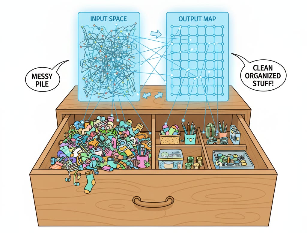
Picture this: You’re a cartographer in the 1400s, and explorers keep bringing you descriptions of new lands. “This place has mountains and cold weather,” says one. “This one has beaches and tropical fruit,” says another. Your job? Organize all these places on a map so that similar places end up near each other, even though you’ve never seen any of them yourself.
That’s essentially what a Self-Organizing Map (SOM) does, except instead of lands, it’s organizing high-dimensional data, and instead of using your brain, it’s using an elegant neural network architecture that learns entirely unsupervised.
Created by Teuvo Kohonen in the 1980s (which is why they’re also called Kohonen maps), SOMs are one of those beautiful algorithms that feel almost biological in how they work. They self-organize. They learn without supervision. They create topological maps where similar things cluster together. And unlike t-SNE, which is a visualization tool that happens to do some dimensionality reduction, SOMs are dimensionality reduction tools that happen to produce amazing visualizations.
Let’s dive in.
Competitive Learning on a Grid
Here’s the fundamental insight behind SOMs: what if we created a low-dimensional grid of neurons, and let them compete to represent different regions of our high-dimensional input space? The winner takes responsibility for that region, but also influences its neighbors to represent similar regions.
Think of it like organizing a music festival. You’ve got different stages (neurons) arranged in a physical layout (the grid). Each stage develops its own identity based on what bands it hosts. But stages that are physically close together tend to host similar types of music because of how the booking process works. You wouldn’t put a death metal stage right next to a classical music stage, right? Nearby stages should have similar vibes.
That’s a SOM. The “bands” are your data points, the “stages” are neurons in the map, and the learning process is how each stage develops its musical identity while coordinating with neighbors.
The Architecture: A Grid of Prototypes
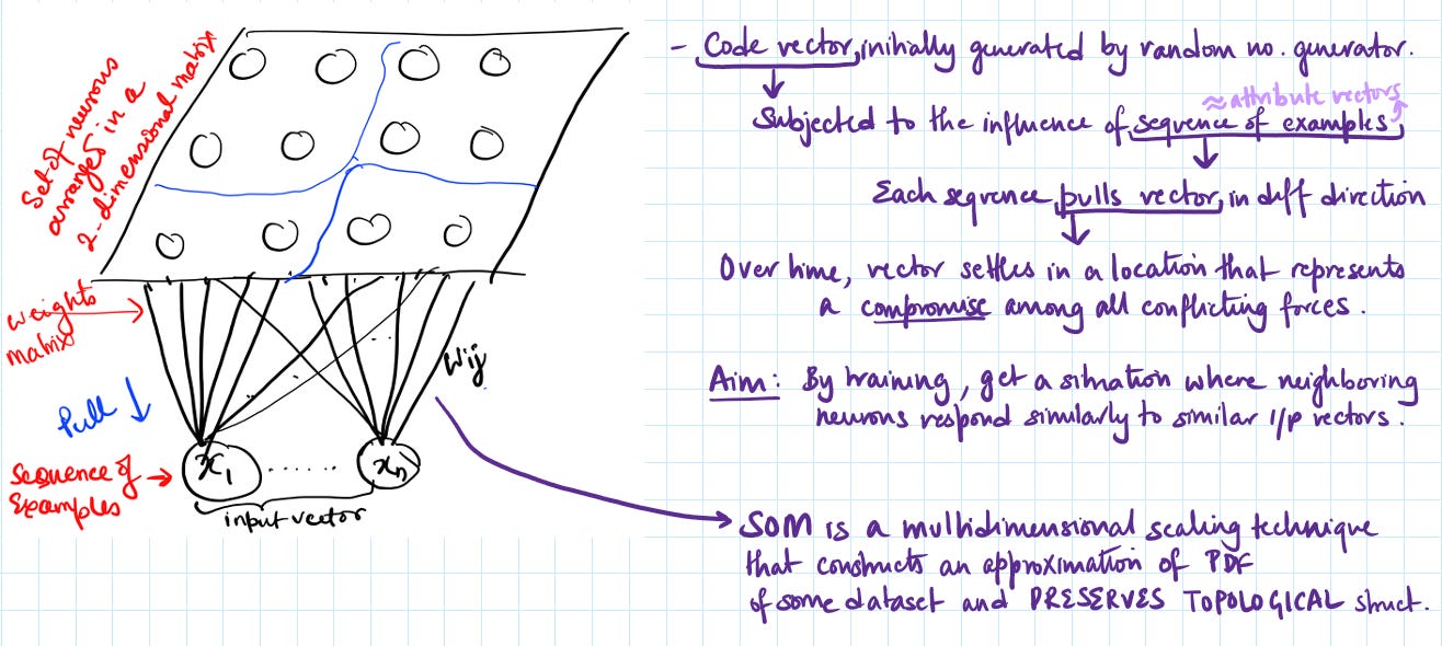
A SOM consists of a grid of nodes (neurons), typically arranged in a 2D hexagonal or rectangular lattice. Each node has:
A position in the grid (like coordinates on a map)
A weight vector that lives in the original high-dimensional input space
The weight vector is the node’s “prototype”- its representation of what kind of data it’s responsible for. If your input data is 784-dimensional (like MNIST digits), each node has a 784-dimensional weight vector.
The beauty is this: the grid structure is low-dimensional (usually 2D), but the weight vectors are high-dimensional. The SOM learns to map the high-dimensional space onto this low-dimensional grid topology.
Competition and Cooperation
SOMs learn through an iterative process that’s wonderfully intuitive. Let me walk you through it step by step.
Step 1: Initialize the Map
First, we randomly initialize the weight vectors for all nodes. At this point, the map is chaotic- each node has random weights and doesn’t represent anything meaningful yet.
Some implementations use smarter initialization (like sampling from the input data or spanning the first two principal components), but random works fine. The map will organize itself regardless.
Step 2: Find the Best Matching Unit (BMU)
Take a random data point x from your training set. Now ask: which node in the grid best represents this data point?
We calculate the distance between the input x and every node’s weight vector w_i:
The node with the smallest distance is the Best Matching Unit (BMU). This is the “winner” - the node that claims responsibility for this data point.
This is the competitive part of competitive learning. All the nodes compete, and one wins.
Step 3: Update the Winner and Its Neighbors
Here’s where it gets interesting. We don’t just update the BMU. We also update its neighbors, with the update strength decreasing as we move farther away.
For each node i, we update its weights:
Let’s break this down:
alpha(t) is the learning rate at time t. It starts high (like 0.5) and decays over time, so early in training we make big updates, and later we make fine adjustments.
h_{BMU,i}(t) is the neighborhood function. This determines how much node i gets updated based on its distance from the BMU. Typically, this is a Gaussian:
where r_{BMU} and r_i are the grid positions of the BMU and node i, and sigma(t) is the neighborhood radius that also decreases over time.
(x - w_i(t)) is the direction from the current weight to the input. We’re pulling the weight toward the input.
So what’s happening? The BMU moves strongly toward the input. Nearby nodes also move toward it, but less so. Distant nodes barely move at all. This creates smooth transitions across the map.
This is the cooperative part. The winner shares its learning with its neighbors, creating local coordination.
Step 4: Repeat Until Convergence
We keep sampling random data points and updating the map. Over time, two things happen:
The learning rate alpha decreases, so updates get smaller
The neighborhood radius sigma shrinks, so updates become more localized
In the beginning, the entire map is plastic and flexible, with large neighborhoods influencing each other. By the end, only tiny neighborhoods update, fine-tuning local regions.
Typically, training happens in two phases:
Ordering phase: Large learning rate and neighborhood. The rough structure forms.
Convergence phase: Small learning rate and neighborhood. Fine details emerge.
Topology Preservation
Here’s what makes SOMs special: they preserve the topology of the input space.
What does that mean? If two data points are similar in the high-dimensional input space, their BMUs will be close together on the grid. If they’re very different, their BMUs will be far apart.
But it goes deeper. The map doesn’t just cluster similar things together- it also arranges clusters in a meaningful way. Intermediate regions of the map represent intermediate data. The map learns the manifold structure of your data.
Imagine mapping different types of vehicles. Cars, trucks, and motorcycles might form three clusters. But on the SOM, cars and trucks would be neighbors (they’re similar - four wheels, enclosed), while motorcycles would be farther away. And the region between cars and trucks? That’s where you’d find SUVs and pickup trucks - the hybrid cases.
This is fundamentally different from k-means, which just finds cluster centers without any spatial organization. SOMs give you a structured, interpretable organization.
The Mathematics of Smoothness
Why does the SOM create smooth transitions instead of chaotic boundaries? It’s all in that neighborhood function.
When we update the BMU and its neighbors, we’re essentially saying: “This region of the map should represent data like this input.” But because neighbors get updated too, adjacent regions represent similar data. This creates continuity.
Mathematically, the SOM is minimizing an energy function that balances two competing goals:
Quantization error: Each data point should be close to its BMU’s weight vector
Topographic error: Nearby nodes should have similar weights
The neighborhood function creates a soft constraint that fights against abrupt changes. It’s like geological weathering - rough edges get smoothed out over time.
The decreasing neighborhood radius is crucial. Early on, large neighborhoods create global organization: “This corner is for category A, that corner for category B.” Later, small neighborhoods refine local details: “Actually, within the category A region, this sub-cluster should be here.”
The U-Matrix and Component Planes
SOMs produce beautiful visualizations, but you need to know what you’re looking at.
The U-Matrix (Unified Distance Matrix)
The U-matrix shows the distances between adjacent nodes. For each node, calculate the average distance to its immediate neighbors in weight space (not grid space).
High values (shown as peaks or dark colors) indicate boundaries between clusters. Low values (valleys or light colors) indicate homogeneous regions.
Reading a U-matrix is like reading a topographic map. The “mountain ranges” are cluster boundaries. The “valleys” are cluster interiors. This makes cluster identification intuitive and visual.
Component Planes
You can visualize individual dimensions of the weight vectors. Each component plane shows how one specific feature varies across the map.
For example, with image data, you might see that one corner of the map corresponds to high brightness, another to low brightness. With customer data, one region might represent high income, another low income.
By comparing component planes, you can understand what feature combinations characterize different regions. If the “age” and “income” component planes have similar patterns, those features are correlated in your data.
Hit Histograms
Show how many data points map to each node. Empty nodes might indicate overparameterization (too many nodes) or gaps in your data distribution. Nodes with many hits represent common data patterns.
What Makes SOMs Special
The Biological Inspiration
SOMs were inspired by how the brain organizes sensory information. Your visual cortex has a topographic organization - nearby neurons respond to nearby locations in visual space. Your auditory cortex organizes by frequency. Touch, smell, motor control - all organized topographically.
Kohonen asked: can we create an artificial neural network with similar properties? The answer was yes, and SOMs are the result.
Interpretability
Unlike deep neural networks, which are black boxes, SOMs are highly interpretable. You can visualize the map, see what each region represents, understand the transitions between clusters, and explain the results to non-technical stakeholders.
In reality, SOMs have been used to analyze customer segments, and show executives a visual map where they can literally see “this is the budget-conscious segment, this is the premium segment, and here’s the transition zone”.
Dimensionality Reduction With Structure
PCA gives you orthogonal axes of maximum variance. t-SNE gives you a visualization optimized for local distances. SOMs give you a structured, organized map with interpretable regions and smooth transitions.
The grid structure is both a constraint and a feature. You’re forcing your data onto a predefined topology, which might lose some information, but gains you interpretability and structure.
Noise Robustness
SOMs are surprisingly robust to noise and outliers. The neighborhood function acts as a regularizer - no single data point can drastically change the map because updates are smoothed across neighbors. Outliers might claim nodes at the map edges, but they won’t disrupt the overall organization.
The Limitations and Gotchas
The Topology Is Fixed
You decide the grid topology upfront - rectangular or hexagonal, 10x10 or 20x20. If you choose wrong, you’re stuck. Too few nodes and you lose detail. Too many and you get overfitting or empty nodes.
There’s no perfect formula. Common practice: start with 5*sqrt{n} nodes for n data points, then experiment.
The Grid Constrains the Mapping
SOMs force your data onto a 2D grid. If your data naturally lives on a different topology (like a 3D manifold or a tree structure), the SOM will distort it to fit the grid.
Imagine trying to map a globe onto a flat surface - you get distortions. Same with SOMs. Some structures just don’t fit well onto rectangular grids.
Computational Cost
Training SOMs requires multiple passes through the entire dataset, calculating distances to all nodes for each data point. For large datasets or high-dimensional data, this gets expensive. Not as bad as t-SNE, but slower than PCA.
No Probabilistic Framework
Unlike Gaussian Mixture Models or variational autoencoders, SOMs don’t give you probability distributions or confidence estimates. You get hard assignments to BMUs, not soft probabilities. This limits some statistical analyses.
The Border Problem
Nodes at the edges and corners of the map have fewer neighbors than central nodes. This can create artifacts where border regions are underutilized or organize differently than the interior. Some implementations use toroidal topology (wrapping edges) to mitigate this.
When to Use SOMs
Perfect Use Cases:
Exploratory data analysis where you want to understand the structure and organization of your data. SOMs excel at revealing natural groupings and how those groupings relate to each other.
Customer segmentation. Map customers onto a SOM, identify natural segments, understand transitions between segments, and target marketing accordingly. The interpretability makes this a killer application.
Quality control and anomaly detection. Train a SOM on normal data, then see where new data points land. Points mapping to sparse or edge regions are potential anomalies.
Feature extraction. Use the BMU coordinates as low-dimensional features for downstream tasks. Unlike t-SNE, SOM provides a deterministic mapping you can apply to new data.
Visualizing high-dimensional time series. Map time series to SOMs based on shape, pattern, or statistical features. Useful in finance, sensor monitoring, and speech analysis.
Bad Use Cases:
When you need precise distance preservation. SOMs preserve topology, not exact distances. For that, use MDS or PCA.
Very high-dimensional data where the curse of dimensionality makes distance calculations unreliable. SOMs rely on meaningful distances in the input space.
When you have clear labels and want supervised dimensionality reduction. Use LDA instead.
Real-time applications requiring fast predictions. Training is slow, and even mapping new points requires calculating distances to all nodes.
When your data has obvious non-grid topology. If your data is clearly hierarchical, use hierarchical clustering. If it’s tree-like, use dendrograms.
SOMs vs The Competition
SOMs vs k-means: k-means just finds cluster centers. SOMs find cluster centers AND organize them spatially. If you want more than just clusters - if you want to understand relationships between clusters - use SOMs.
SOMs vs PCA: PCA finds linear projections maximizing variance. SOMs find nonlinear mappings preserving topology. PCA is faster and simpler. SOMs are more flexible and interpretable for complex data.
SOMs vs t-SNE: t-SNE optimizes for visualization, is stochastic, and doesn’t allow new point projection. SOMs are deterministic, allow new point mapping, and produce structured grids. t-SNE for pretty exploratory plots. SOMs for interpretable, reproducible analysis.
SOMs vs Autoencoders: Autoencoders learn nonlinear encodings and decodings, are more flexible, and scale better. SOMs provide topological organization and interpretability. If you need to reconstruct your data or handle massive scale, use autoencoders. If you want interpretability and structure, use SOMs.
Practical Tips and Tricks
Grid Size Matters: Start with 5*sqrt{n} nodes as a rule of thumb, but experiment. Visualize the U-matrix and hit histogram. If you see lots of empty nodes, shrink the grid. If boundaries are unclear, grow it.
Hexagonal vs Rectangular: Hexagonal grids are more isotropic - each node has the same number of equidistant neighbors (six). Rectangular grids are simpler to implement and visualize. For most applications, the difference is minor.
Normalize Your Features: SOMs use Euclidean distance. If one feature has range [0, 1000] and another has range [0, 1], the first will dominate. Standardize or normalize first.
Two-Phase Training: Use a long ordering phase with large learning rate and neighborhood, then a longer convergence phase with small values. A common schedule: 1000 iterations for ordering, 10000 for convergence.
Toroidal Topology for Edge Artifacts: If border effects bother you, implement toroidal wrapping where the grid edges connect. This eliminates the border problem but makes visualization slightly less intuitive.
Use SOMs for Preprocessing: Train a SOM, then use BMU coordinates as features for classification or regression. This nonlinear dimensionality reduction can improve downstream performance.
Interpret Component Planes Together: Don’t look at component planes in isolation. Compare them to understand feature interactions and what drives different map regions.
Self-Organizing Maps are one of those algorithms that feel almost magical when you first see them work. You throw in high-dimensional chaos, and out comes an organized, interpretable map. Similar things cluster together, dissimilar things separate, and the transitions between them reveal meaningful structure.
They’re not the fastest algorithm. They’re not the most mathematically elegant. They’re not going to win you any Kaggle competitions. But for exploratory analysis, for understanding your data’s natural organization, for creating visualizations that actually make sense to domain experts, SOMs are phenomenal.
I’ve used SOMs to analyze gene expression data, customer behavior, sensor readings, and text documents. Every time, the structured organization revealed insights that would have been invisible with other methods. The ability to point at a region of the map and say “this is what these data points have in common” is incredibly valuable.
The key is understanding what SOMs do and don’t do. They preserve topology, not distances. They provide structure, not precision. They organize, not classify. They’re exploratory tools, not black-box predictors.
Use them when you want to understand the lay of the land. Use them when interpretability matters. Use them when you need to explain your findings to people who don’t speak mathematics. And use them when you want an algorithm that feels less like a statistical procedure and more like watching an ecosystem self-organize.
Because that’s what SOMs do- they self-organize. And there’s something deeply satisfying about watching order emerge from chaos, one training iteration at a time.